Disclaimer: The logos used in this creative non-commercial project are the property of their respective companies. I do not own any rights to these logos, and they are not intended for commercial use. Any creative interpretation of the logos is solely an artistic expression and does not imply any infringement of copyright or trademarks of the companies whose logos have been used. The purpose of using the logos in this project is purely educational and exploratory, and does not imply any transfer of rights to these logos.
This project continues my series of creative non-commercial works called Artistic interpretation of iconic logos in which I present artistic interpretations of some of my favorite graphic design pieces.
This series was initiated in 2018 with a project commissioned by Adobe for ADOBE CREATIVE CLOUD 2018. Since then, periodically, I have created commercial works altering logos for companies such as Adobe, MAC, Sephora, Wired, MSI, Gigabyte AERO, and others.
Logos play the role of visual symbols and metaphors of modern consumer society. From corporate elements, these symbols have become an integral part of mass culture. By abstracting the logo, ignoring its corporate colors, forms, specific details, I create abstract compositions using paint drips. Personalizing the logo and changing its context, I evoke emotions that I experience during the process and draw from past experiences interacting with this logo.
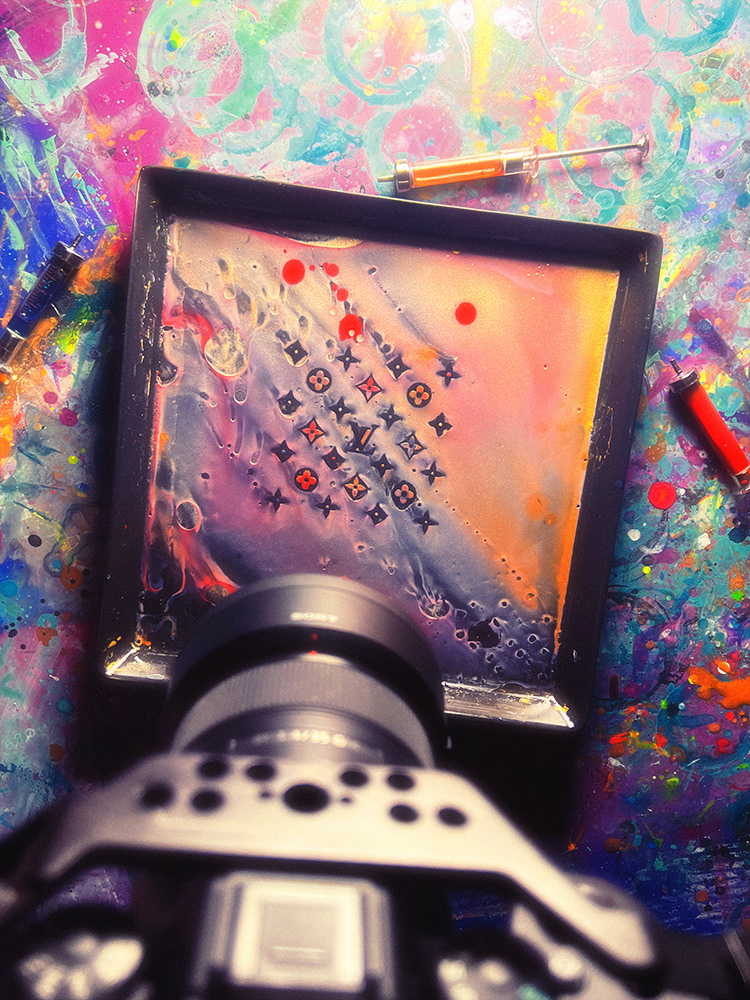
Louis Vuitton
Interwoven letters L and V, created by the founder of the Louis Vuitton brand in the 19th century, have since remained an enduring symbol of status, luxury, and elegance. The Monogram Canvas is one of the most renowned uses of patterns in corporate identity. My creative challenge was to work with this pattern. It's quite complex and inconvenient for my free and chaotic style. The beauty revealed itself in movement.



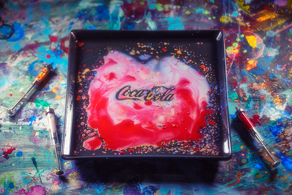
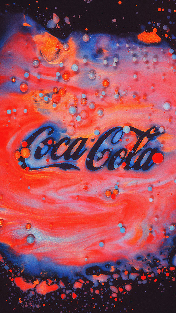
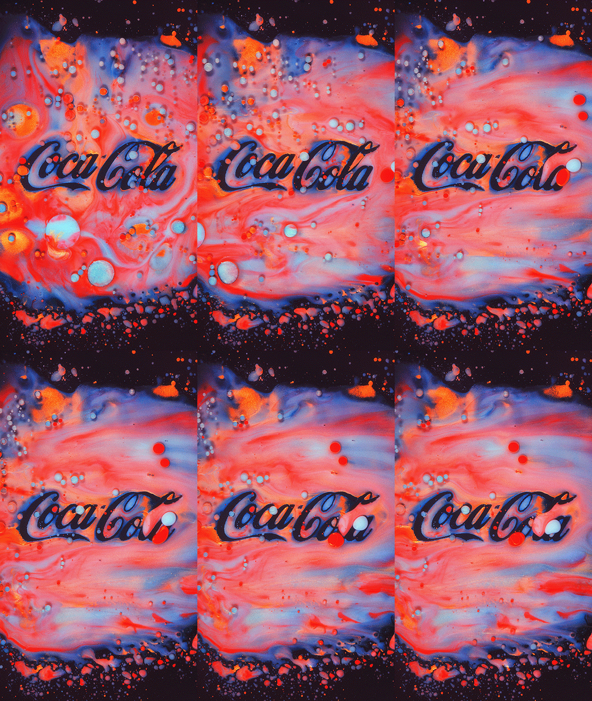
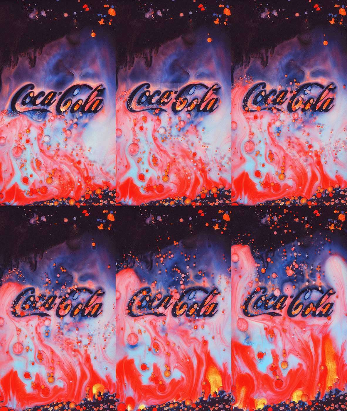
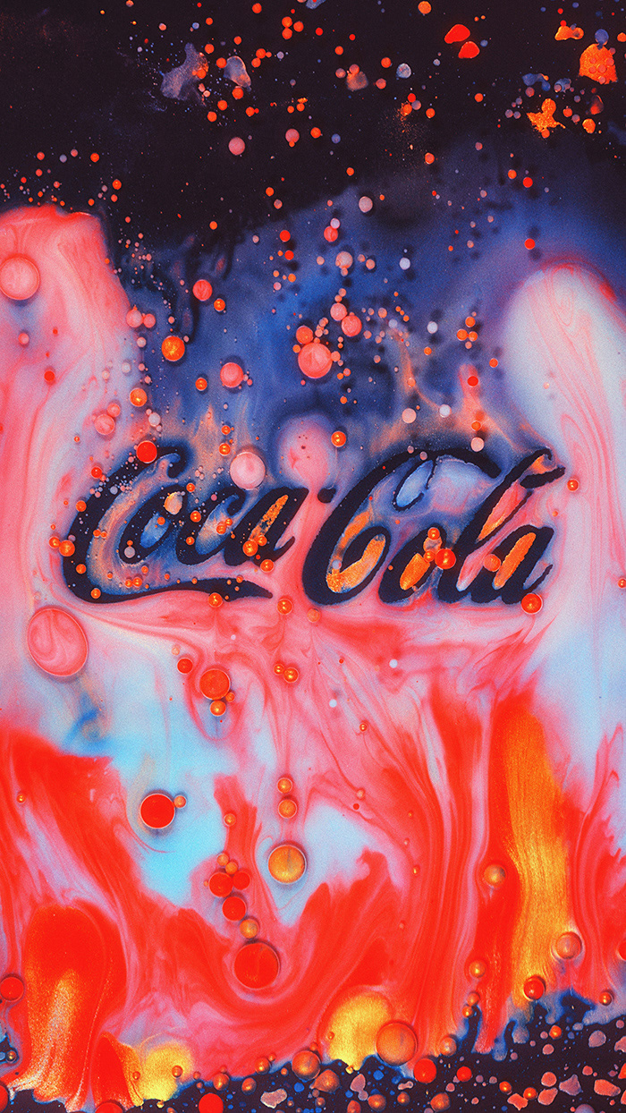
Coca-Cola
It's what they call a classic. This logo has been around since the late 19th century, undergoing minor modifications. And although I haven't consumed soda for a long time, this logo will always be in my personal top list, partly due to the emotional attachment to the brand.
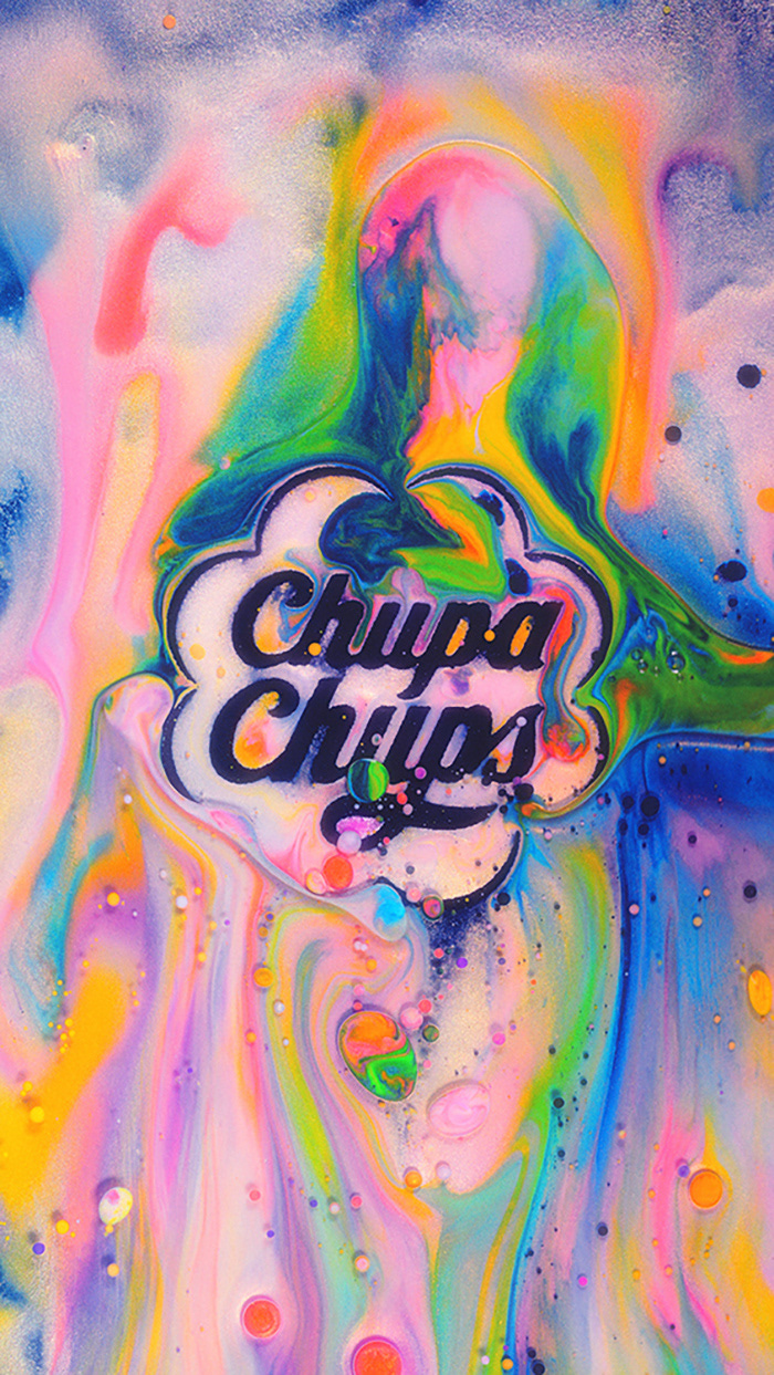
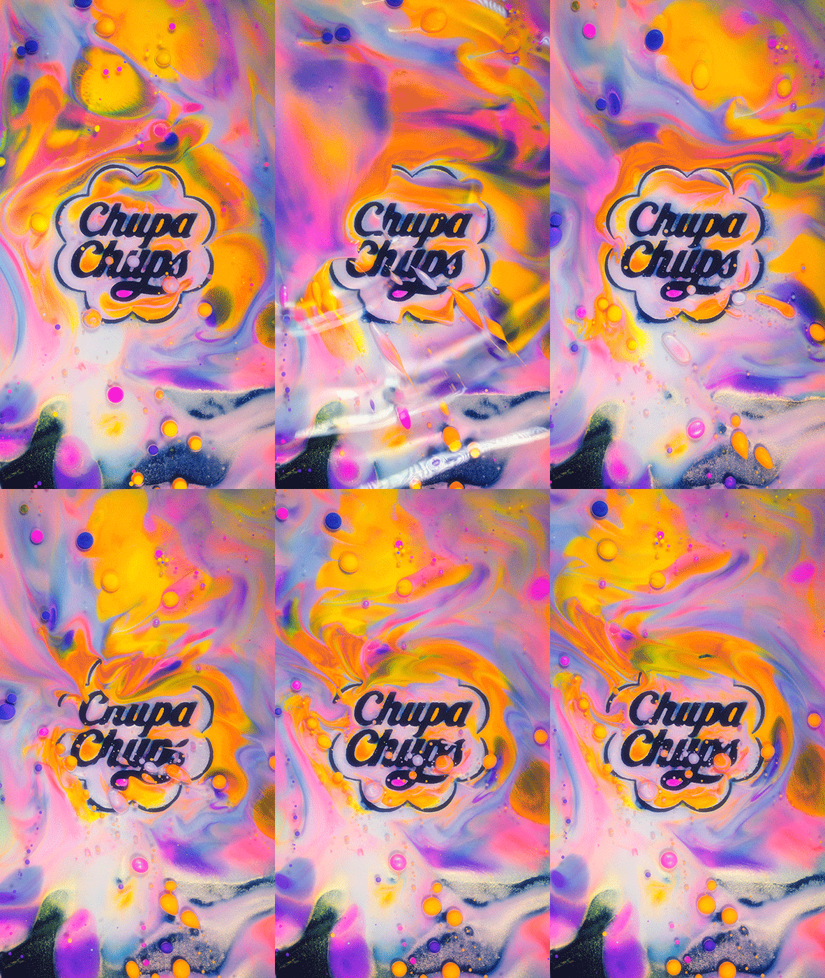
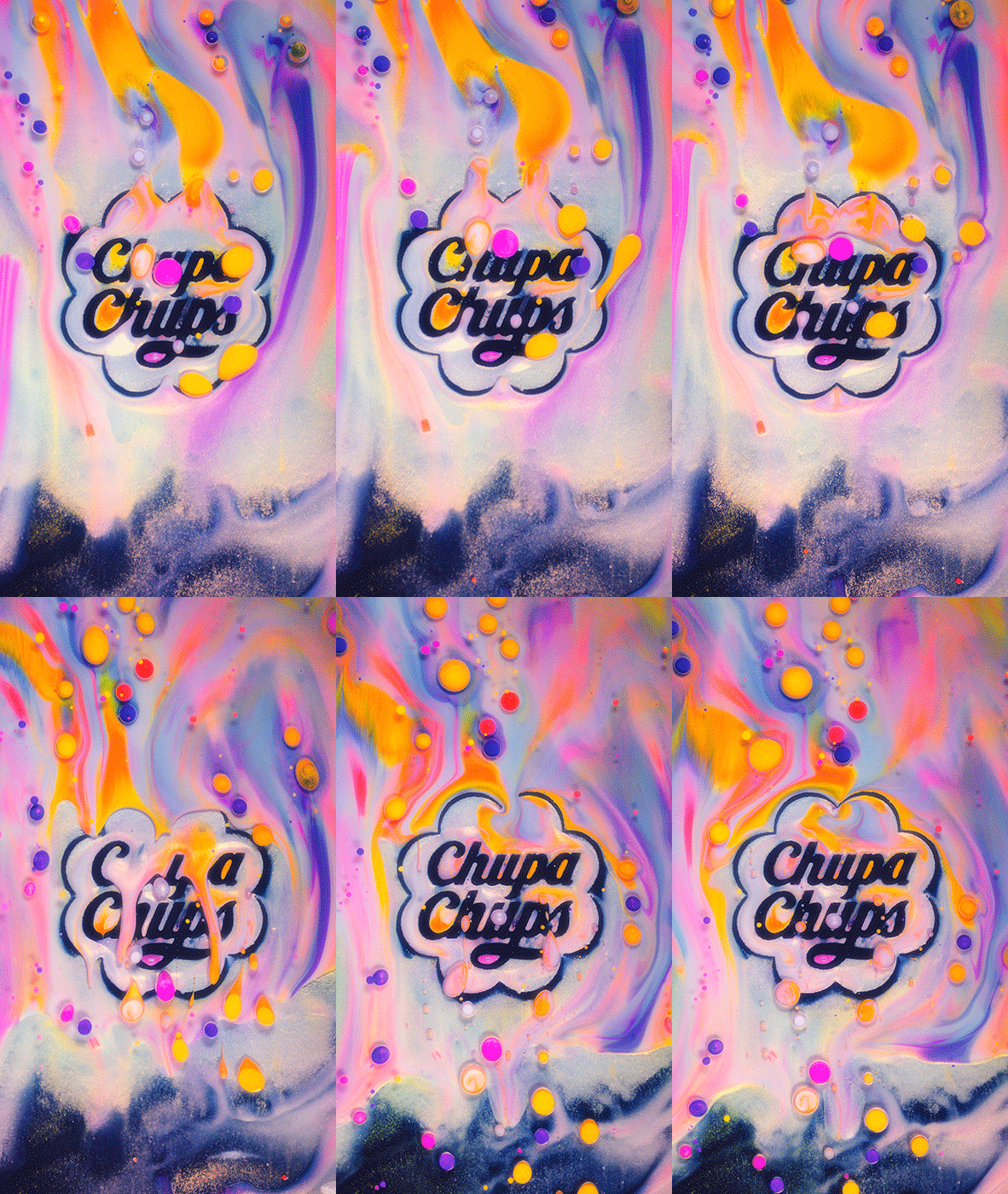
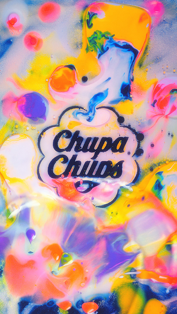
Chupa Chups
The well-known story is that the idea to use the silhouette of a daisy was suggested to the company's founder, Enrique Bernat, by none other than Salvador Dalí in 1969. Additionally, as a brilliant marketer, Dalí proposed placing this symbol at the top of the packaging. I don't know of any other examples where another great artist created such successful logos.
MTV
MTV Logo – it's an emblem of an era. Personally for me, it has become one of the standard of beauty in graphic design with its original graphic concept. It evokes a parallel association with "The Simpsons' couch gag," where, although the concept remains unchanged, each gag has its unique variation, making it special and intriguing.
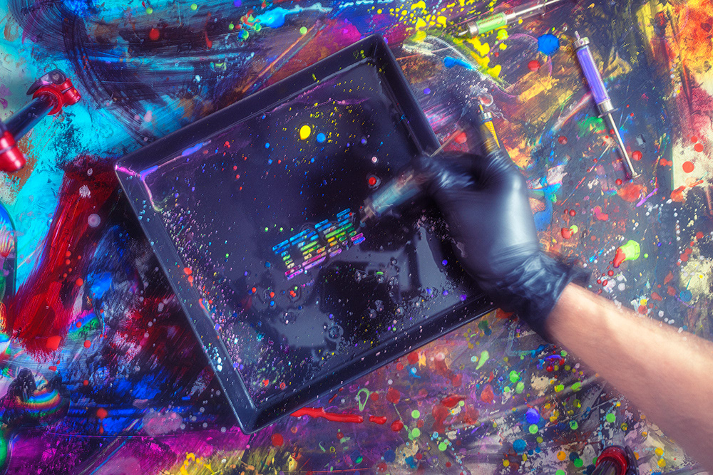
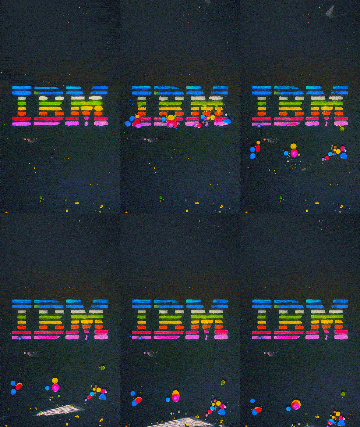
IBM
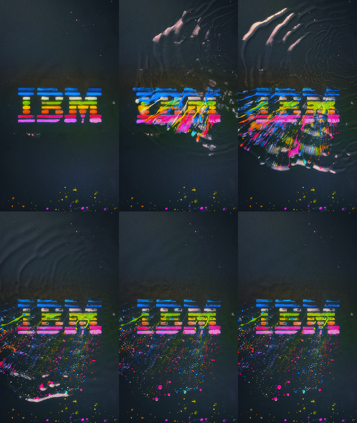
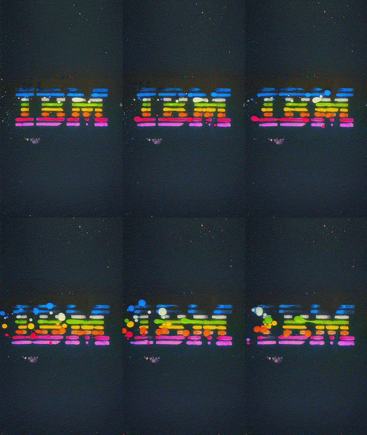
I couldn't overlook the work of one of my favorite graphic designers - Paul Rand. The logo he created for IBM in 1972 is a timeless classic that still looks relevant even half a century later. It's a stable and enduring example of effective design. Such a strict logo is a challenge for me; it seems very simple in form, but incredibly inconvenient for my style. In my first attempt, I experimented with the shape of this logo several years ago, and only now have I managed to create something interesting.
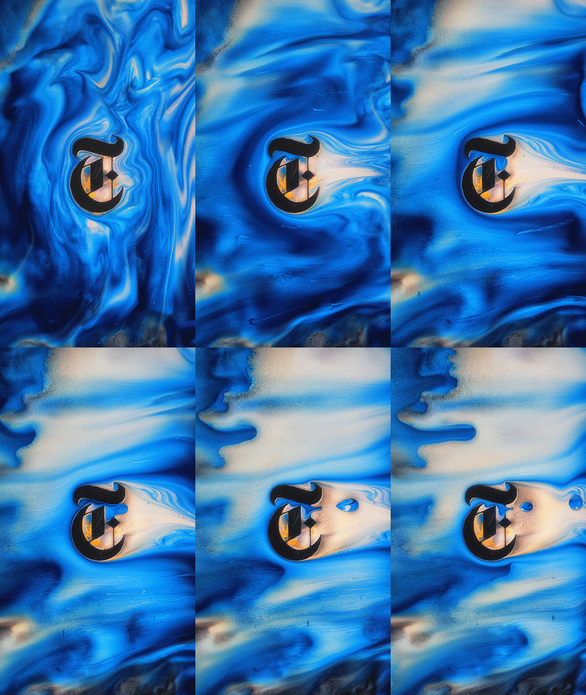
The New York Times
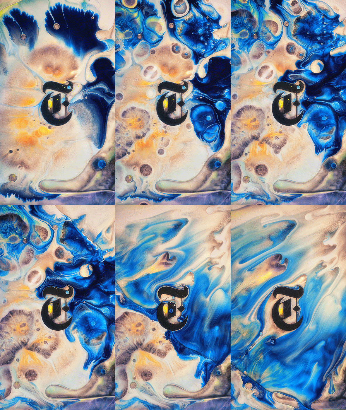
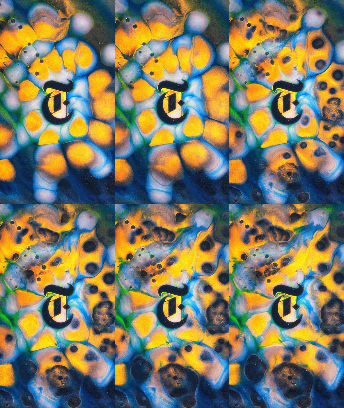
Initially, I didn't even consider this logo as a subject for my experiments. I simply wanted to work with the shape of a Gothic font, and I began recalling all the logos that use such a style. Besides logos of some music bands, nothing else came to mind. But then I remembered one of my favorite typographic works that has a captivating atmosphere - a photograph by photographer Jo Metson Scott for The New York Times Style Magazine fall 2010.
behind the project
