My journey in typography is an exploration of organic beauty, created without CGI or AI.
All the works presented in this project are based on photography and video.
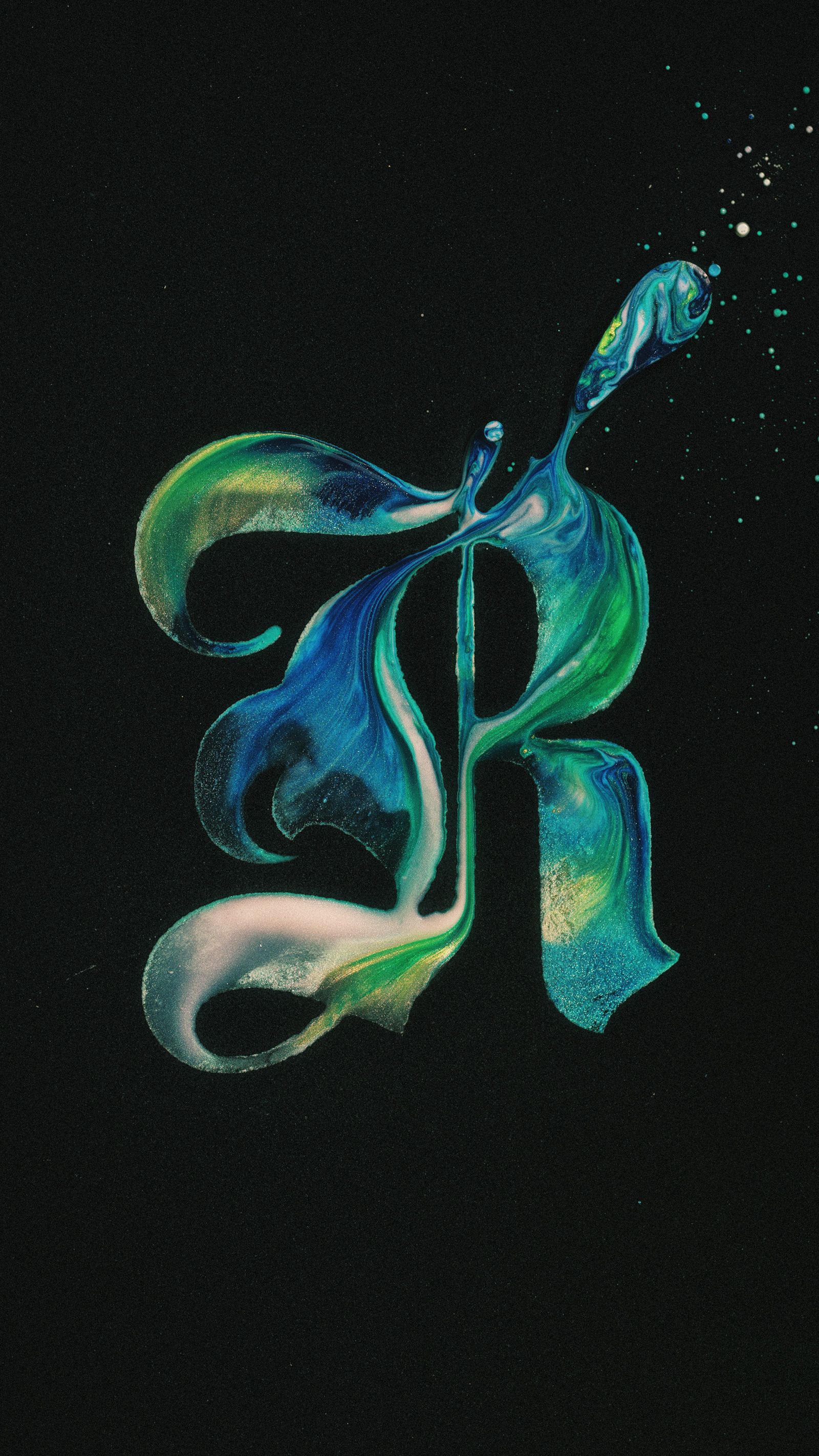
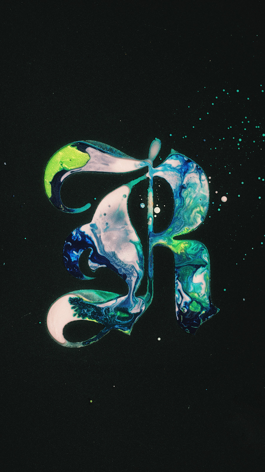
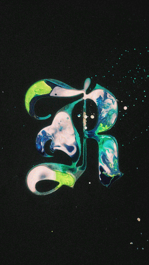
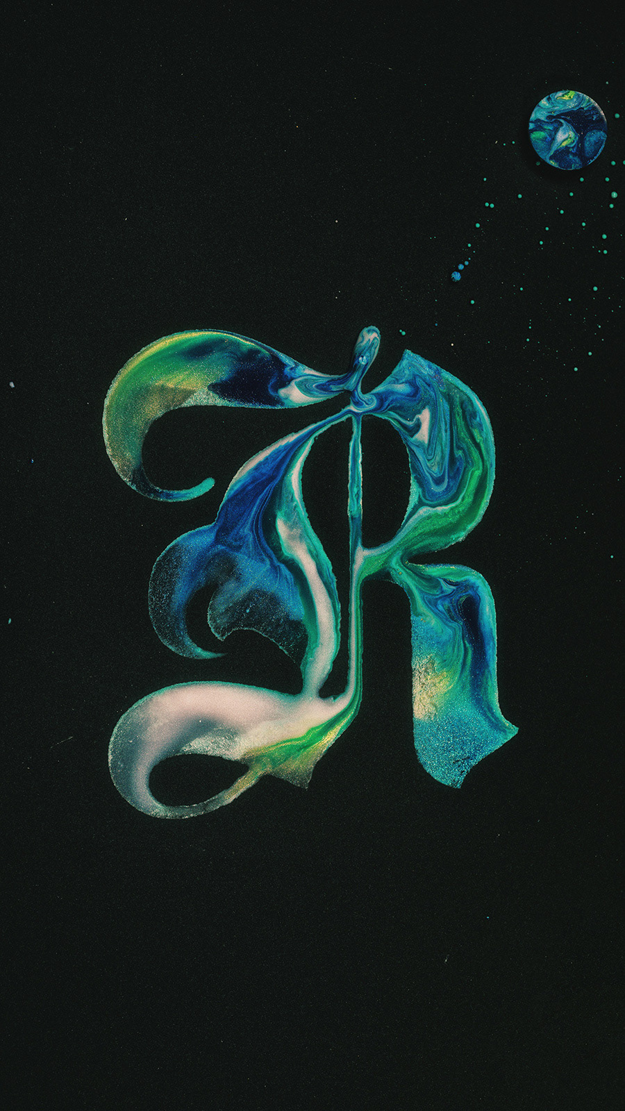
I find inspiration in the most unexpected materials and techniques to create typefaces where physical processes become an integral part of the visual language.
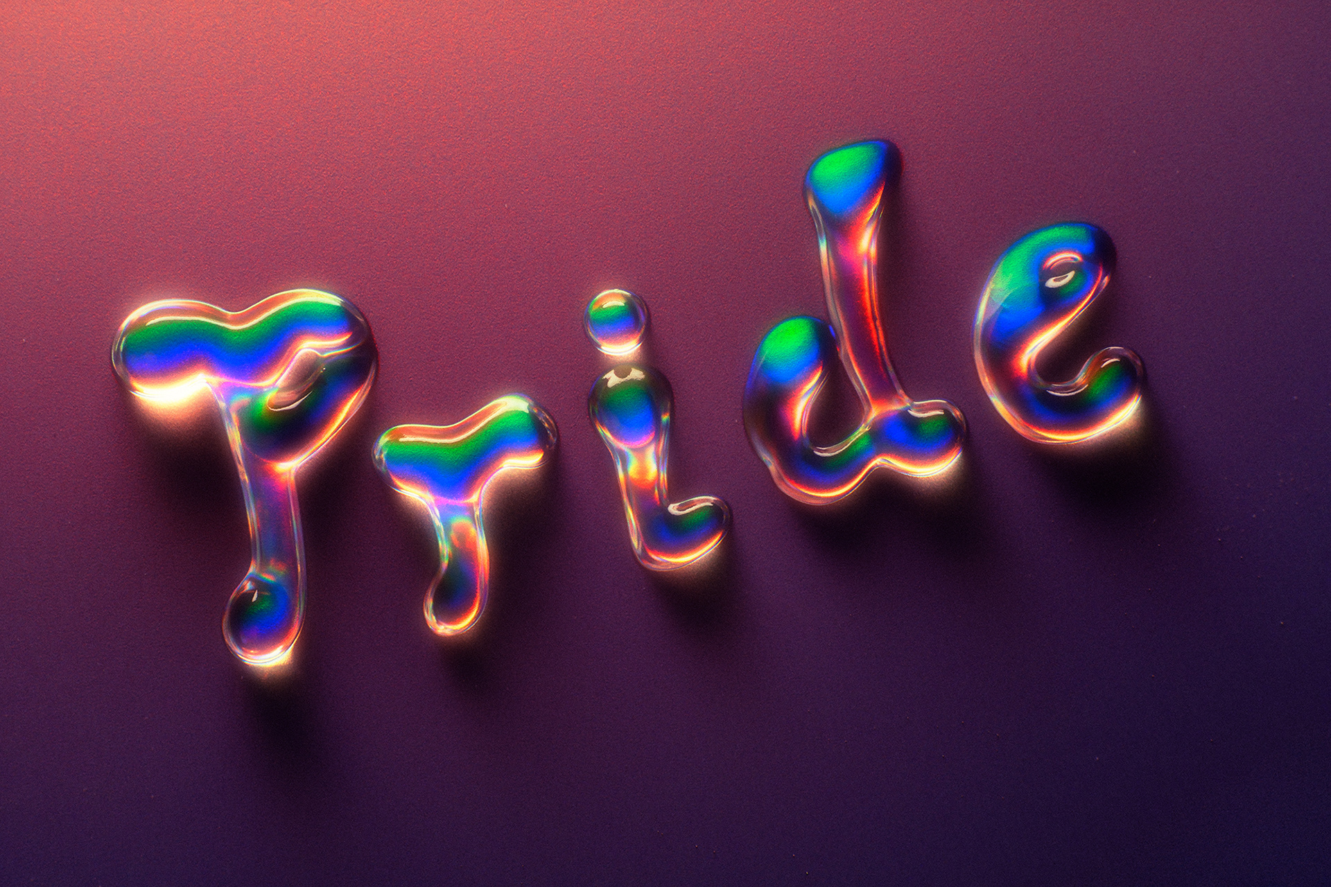
Each letter in this series is created through the interaction of acrylic paints, oil, and water. I explore how textures, colors, and layers intertwine, forming unique compositions. This process allows me to craft typefaces that convey a sense of motion, fluidity, and harmony.
Spectrum Typography
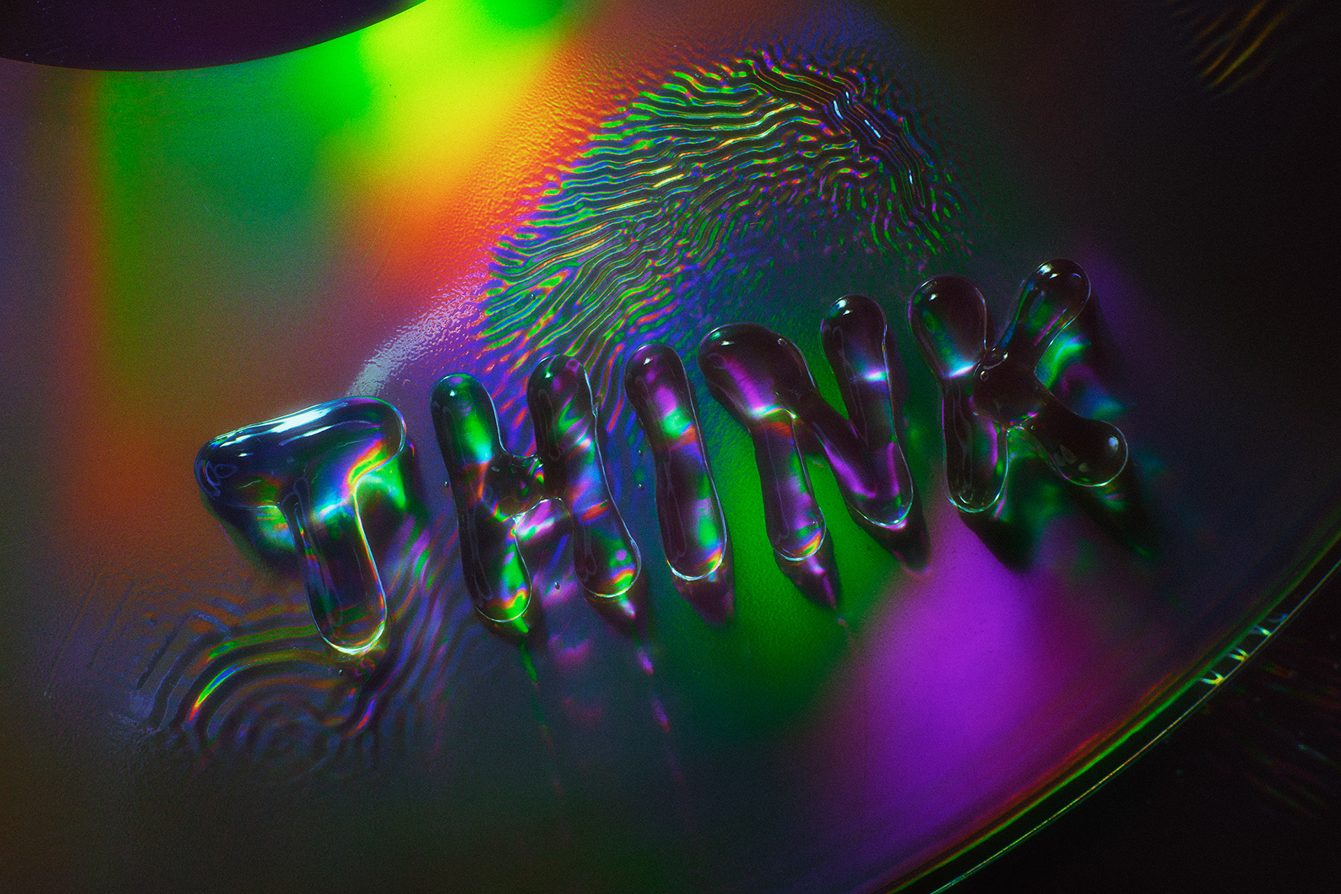
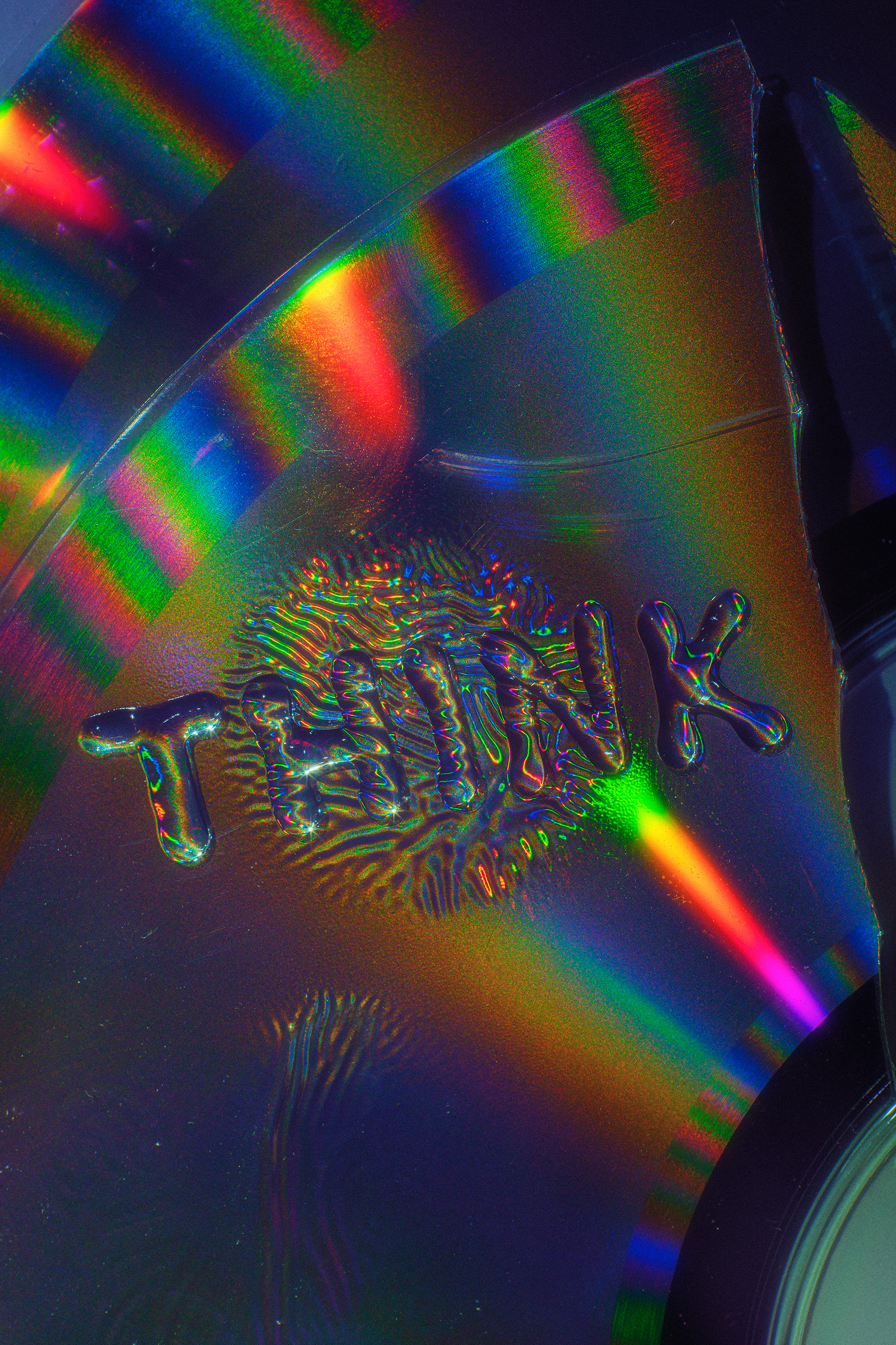
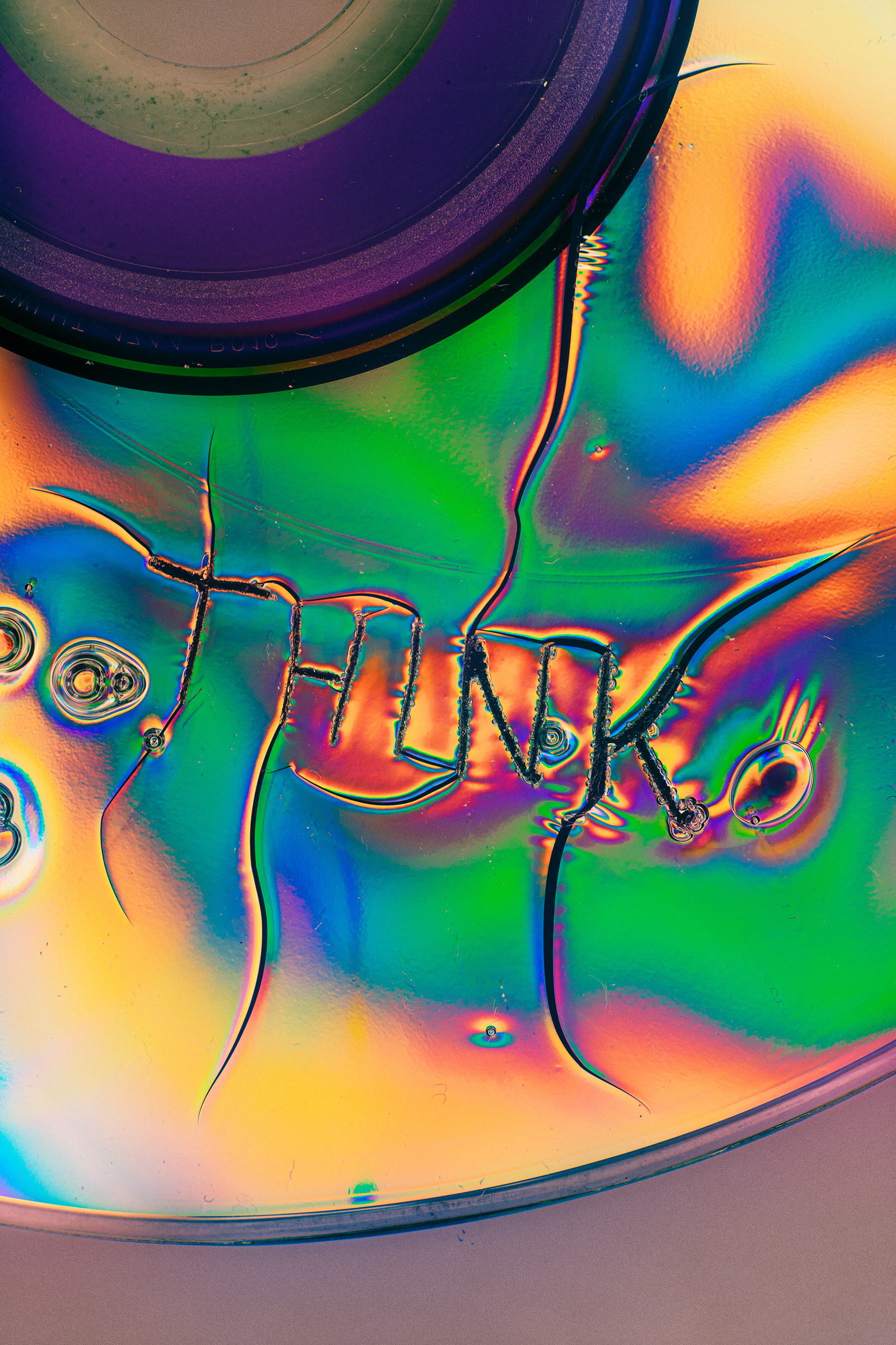
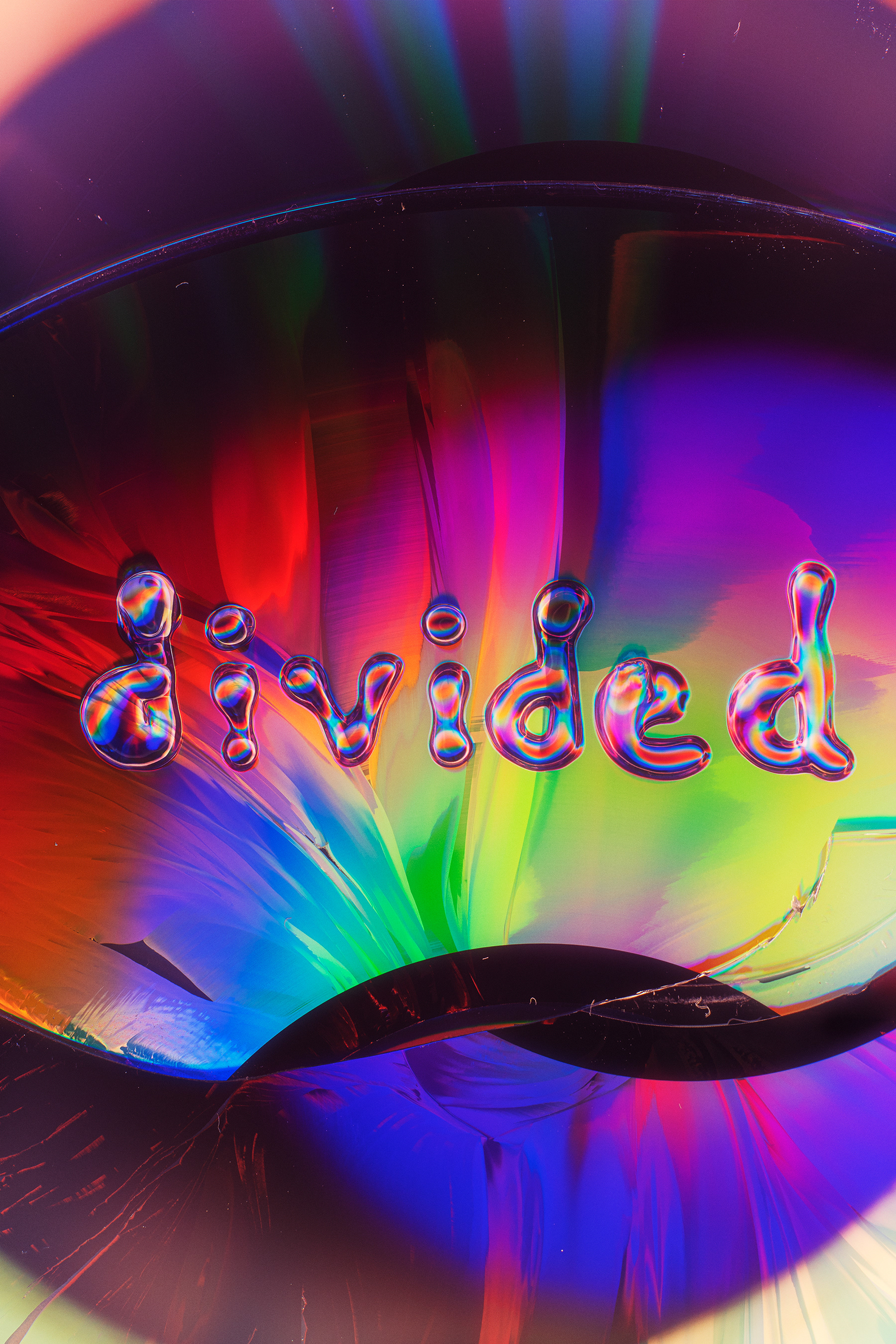
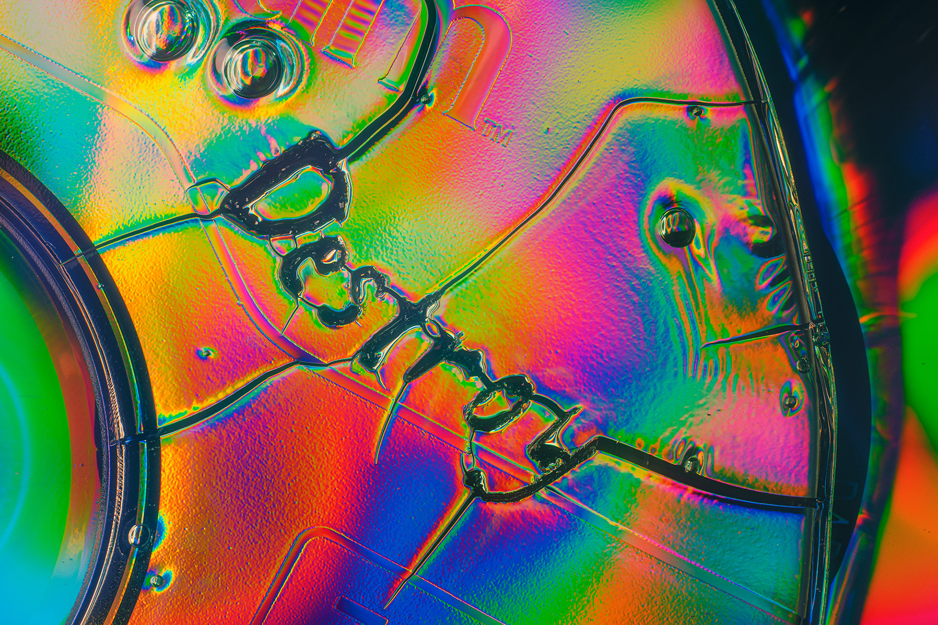
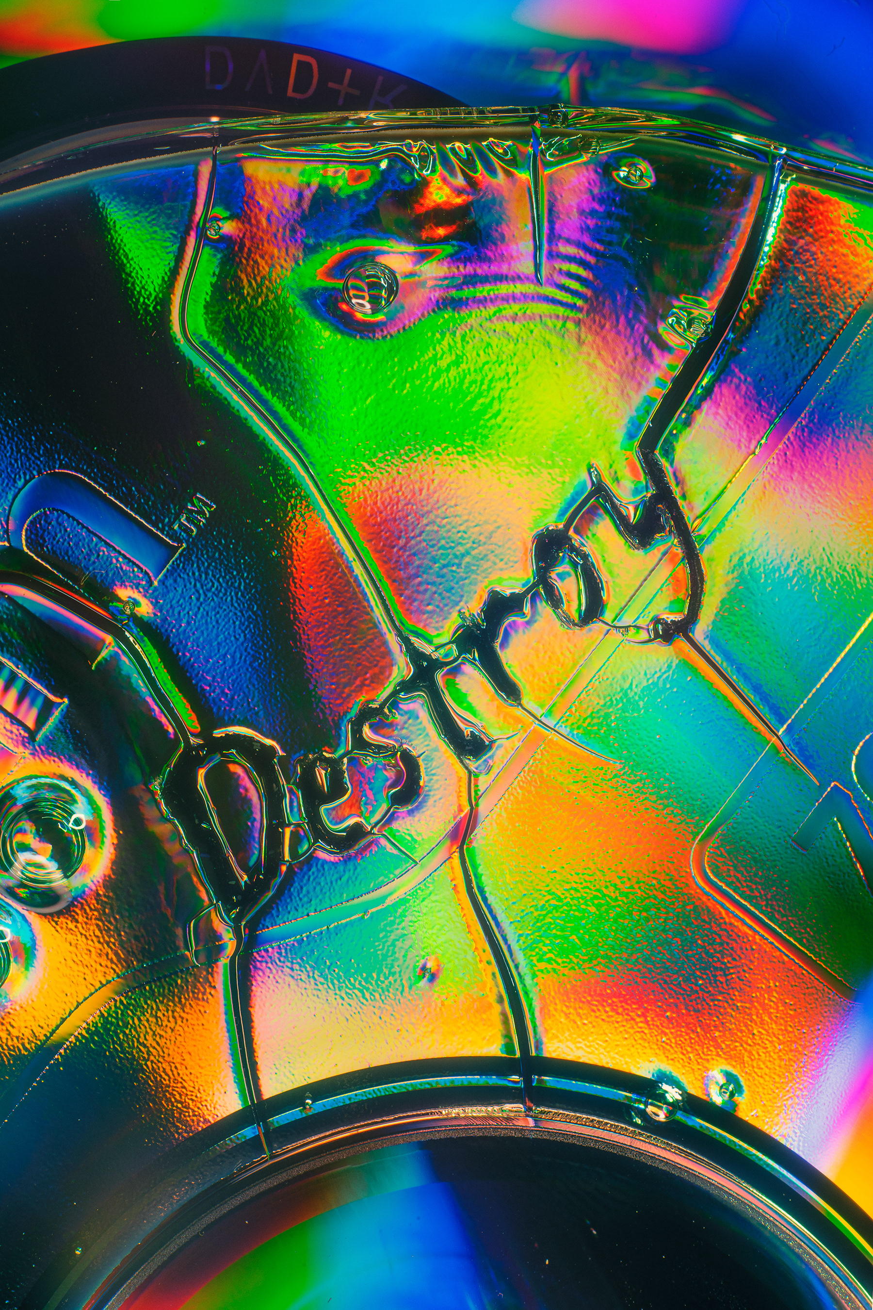
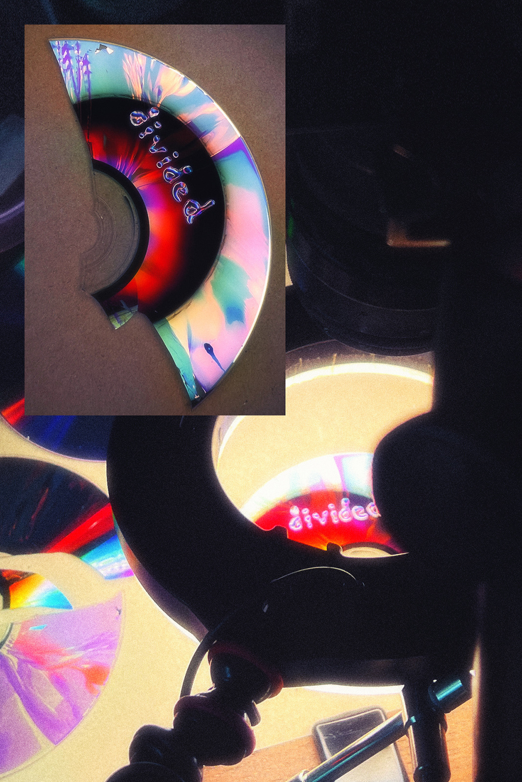
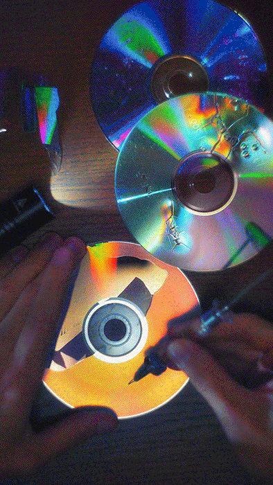
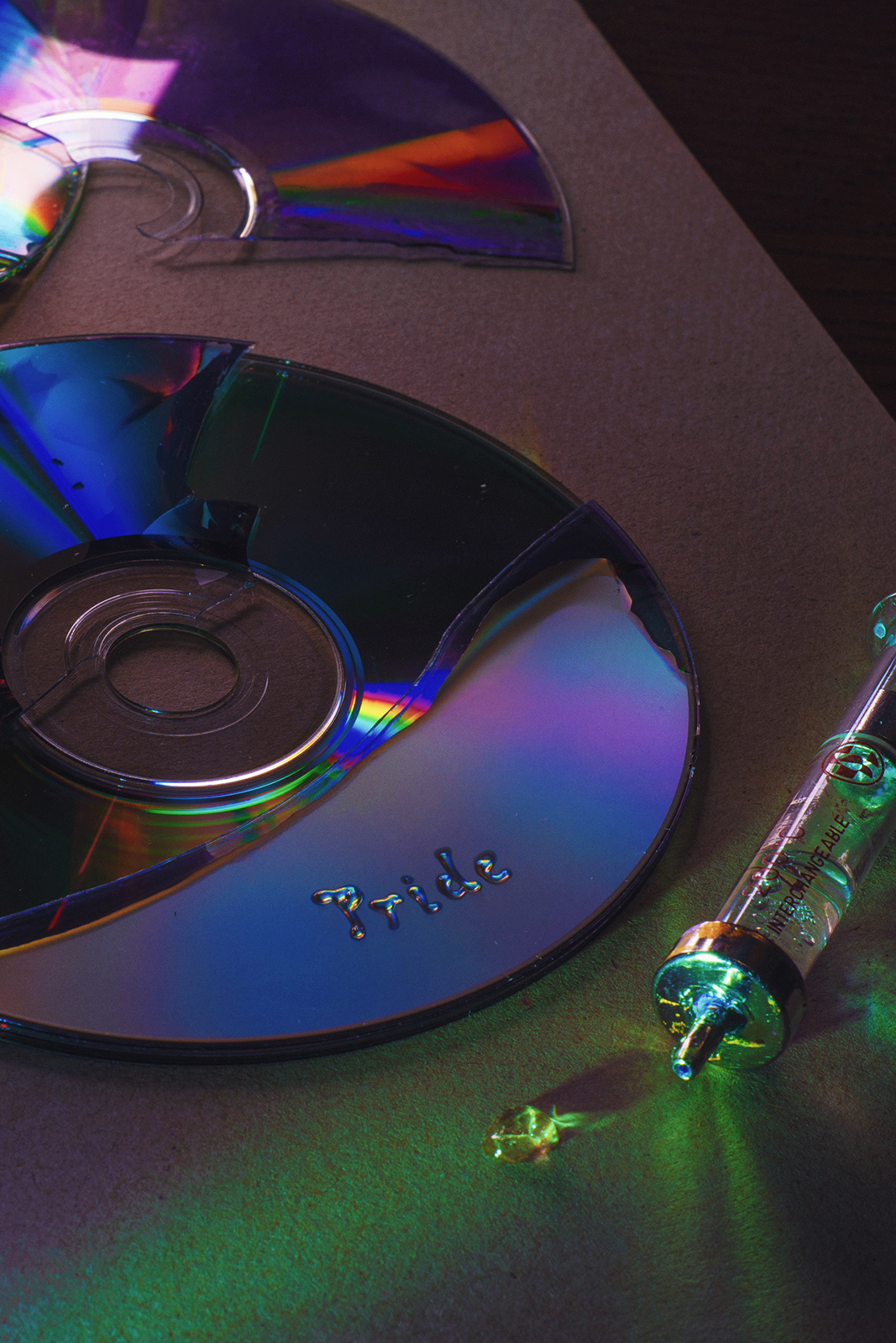
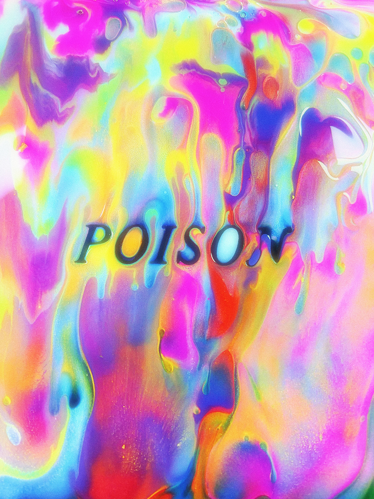
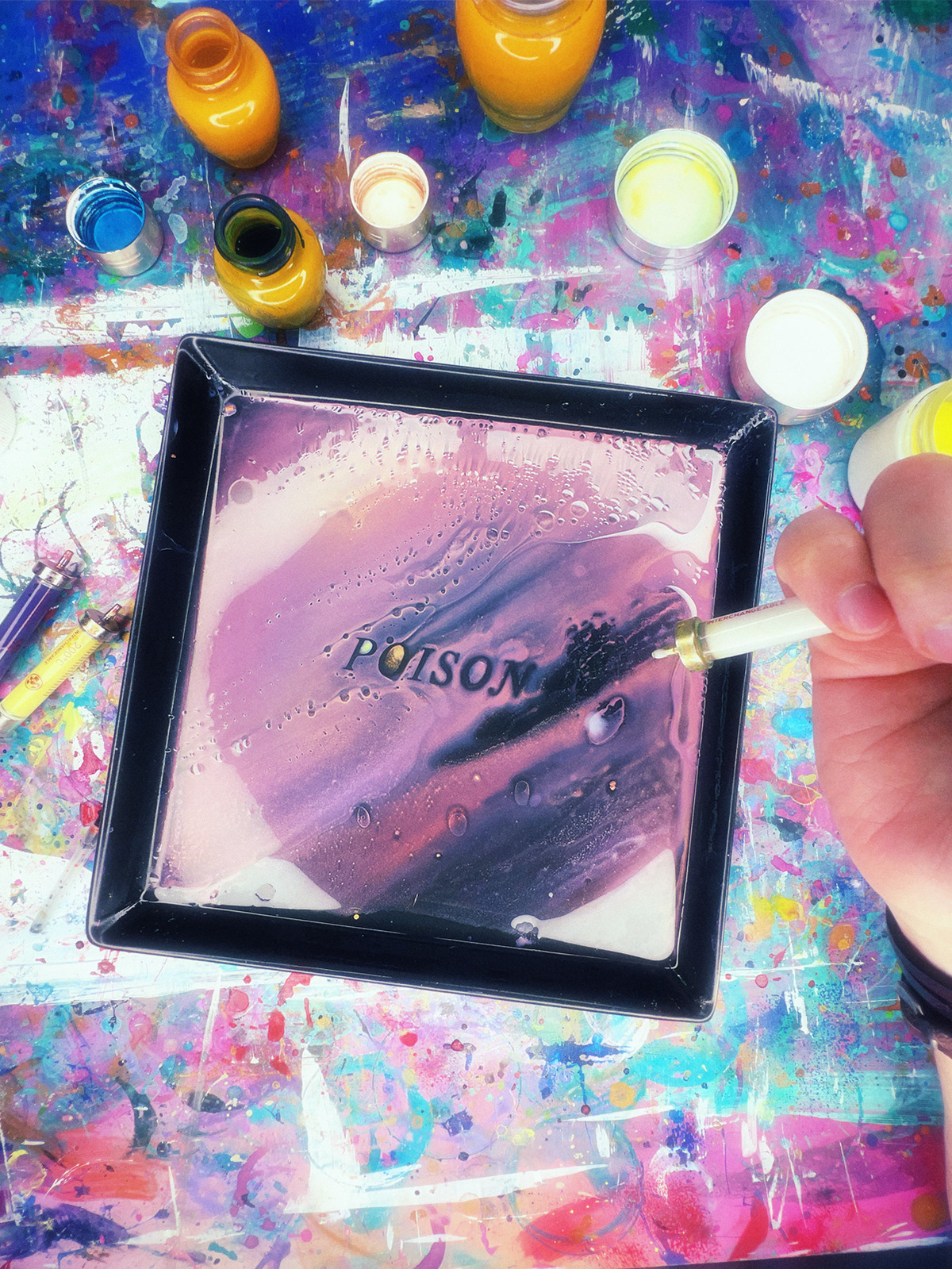
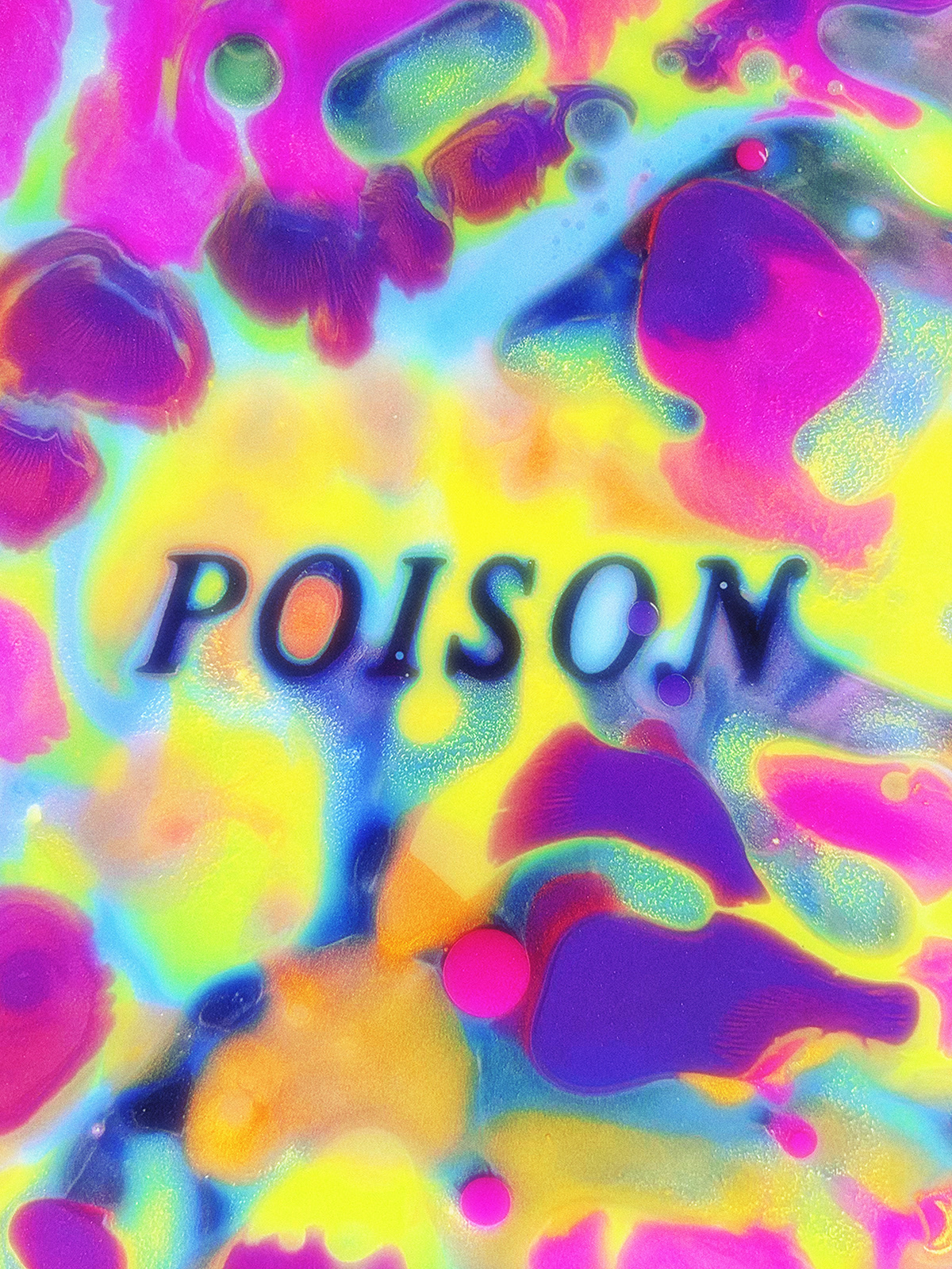
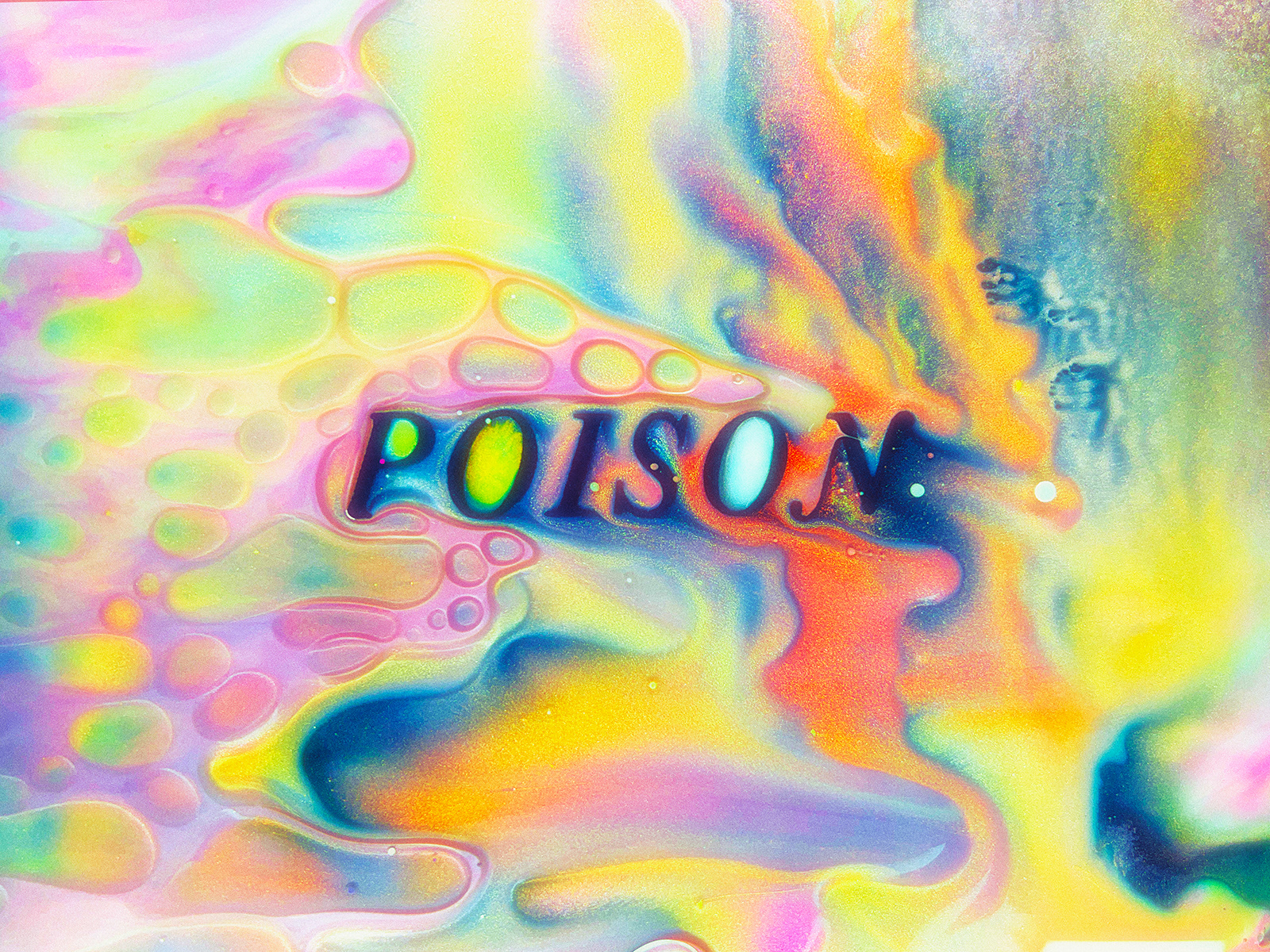
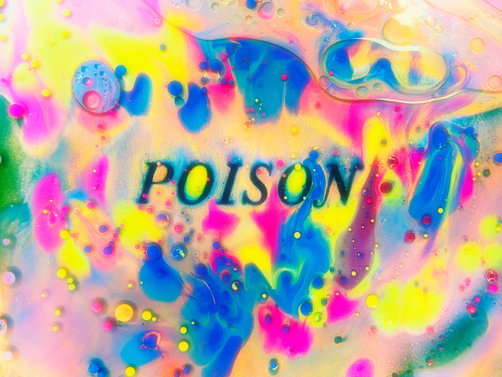
This series examines how letters reveal the fragility of CDs, once a symbol of digital reliability. Through destruction and the interaction of liquids with the surface of compact discs, unique forms are born. The effects of refraction, reflection, and fluidity shape letters with vivid colors and intricate textures that seem to come alive in motion.
The brilliance of CDs and the chaotic nature of liquids merge to transform vulnerability and destruction into mesmerizing visual inspiration.